
WYSIWYG Editor

What is it?

The WYSIWYG (What You See Is What You Get) is a visual editor that allows you to create or edit content on the Text Content component. 
 

Editing in Full Screen Page View

Image
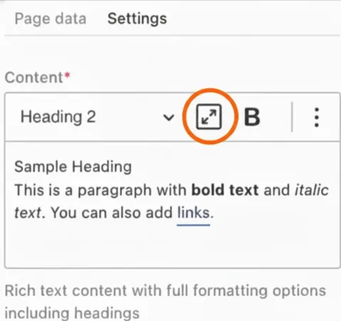
Screen shot of the SUpal editor showing the full screen option

It is recommended that you edit your content in the full-screen page view. This will give you the most accurate view of what your content looks like. To do this, navigate to the right-hand settings menu and select the square with two diagonal arrows icon. 
 

Full Screen Page View 

Image
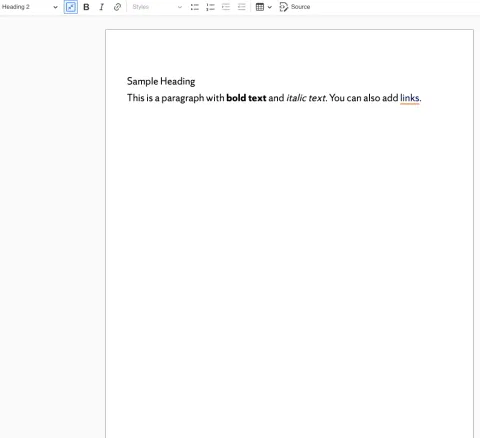
Drupal Canvas Full Screen Mode

When you open the page, you’ll see multiple styling options at the top. The tabs at the top of this page will help you to learn more about each menu option and how to use them.

Page Formatting Options

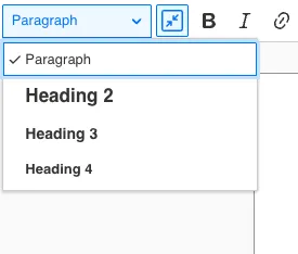
From this menu, you can choose to style your text as paragraphs or page headings. You also have the option to bold, italicize or link text.  
Paragraphs

Image
Drupal heading dropdown menu options.

Paragraphs are blocks of text used to structure and organize content into readable sections. Browsers automatically start a paragraph on a new line and add some vertical white space before and after it, making it distinct from other content on the page.

  • Structural Purpose: The paragraph tag is used to define individual blocks of continuous text, grouping sentences that belong to a single topic or idea.
  • Accessibility: Screen readers read paragraphs as continuous blocks of text, but users typically cannot navigate by paragraph alone in the same way they can by headings. Proper use of paragraphs makes content more digestible and less overwhelming for all readers.
  • SEO: While not as critical for defining structure as headings, well-written paragraphs containing relevant keywords are essential for providing detailed, informative content that search engines value.
  • Styling (Default): Paragraphs are block-level elements that start on a new line and are separated from adjacent content by blank space (margins), making the text easier to read.

Floating an Image Around Text 

Floating an image with text is a technique (float: left, center or right) to align an image to one side, allowing text and paragraphs to flow around it.
  1. In your text area, select the "Insert Media" icon.
  2. Insert your selcted media to the page.
Image
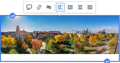
Instructions on how to float an image with text in Drupal.

3. Click on the image and select its alignment (Break text, align left and wrap text, Align center and wrap text,  align right and wrap text). 

4. Drag and drop your image to where you want it to wrap around the text. 

Adding Linked Text or a Phone Number 

This section will take you through step-by-step how to add a normal link and a phone number link into Drupal. 
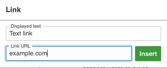
Link text 

  • To add a link, highlight your text and select the "Link" option from the content drop down menu.
Image
Example of how to add link text in the Drupal CMS system.
  • Add the Display Text. This is what will appear on the front end of your website.
  • Add the Link URL. This will tell Drupal where the link goes using HTML tags to connect words to a web address.   
  • Once the link is created, it can also be styled as a button using the Link Properties icon and selecting the desired button style". If you need a more accessible version of the link text, go to the Advanced Options" drop down and fill in the aria label. 

Note: The Mac shortcut ⌘K (Command+K) for adding a hyperlink translates to Ctrl + K (Control+K) on a PC for most applications like Word, browsers and email. However, on Windows, Win + K (Windows Key + K) also works. 
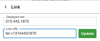
Phone numbers 

  • To add a link, highlight your text and select the "Link" option from the content dropdown menu. Fill out the fields as follows:
    1. Add the Display Text. This is what will appear on the front end of your website.
Image
Directions on how to add a phone number link into the Drupal CMS
  1. Add the Link URL and start the phone number with "tel:+1". This will tell Drupal that the link is a phone number.  

Note:  the "+1" is the country code for the US.  If the number is from a different country, replace the "1" with that countries code.

Example phone number: 315.443.1870

Button Links

This section explains how to create a button from linked text. Using the button link properties in the WYSIWYG editor, you can create call-to-action buttons that link to any URL.
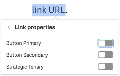
  • Create the link: Type your text, highlight it, click the link icon in the toolbar and enter the link URL.
Image
Instructions on how to turn a text link into a button in Drupal.
  • Apply the button style: Click the linked text and select "Link properties."  From here, you can toggle the button style on (e.g., "Button Primary," "Button Secondary," or "Button Tertiary").
  • Note: to learn more about best practices around using buttons, visit our page on call to actions

Anchor Links

An anchor link allows you to jump directly to a specific section of a page. This requires two steps: creating a unique ID at your target section, then linking to that ID.

Step 1: Create the Anchor ID

  1. Place your cursor where you want the link to land.
  2. Click the Anchor icon (the black flag) in the WYSIWYG editor toolbar.
  3. Enter a unique name using lowercase letters and hyphens (e.g., section-two).

Step 2: Link to the Anchor ID

  1. Highlight the text you want to turn into a link and click the Link icon.
  2. Select or enter the target page URL.
  3. Append a pound sign (#) followed by your anchor name to the end of the URL.

Example:

  • Anchor name: section-two on the "About" page.
  • Resulting link URL: about#section-two


Bulleted, Numbered and Featured Lists

Below is information about what bulleted, numbered and featured lists are and how to use them.

Bulleted Lists

  • Improve readability: Break up long paragraphs into digestible points.
  • Highlight key information: Draw attention to important items without overwhelming the reader.
  • Quick scanning: Visitors can skim the page and grasp the main points immediately.
  • Organize related ideas: Show a group of similar items clearly without implying a sequence.
  • Enhance visual structure: Adds white space and structure, making the page look cleaner.

When to Use Them

  • Summaries of features or benefits
  • Lists of tips, steps (if order isn’t crucial) or key points
  • Quick-reference information, like FAQs or specs
  • Grouped items in guides, tutorials or product pages

Note: Under Block Styles, you’ll find additional custom styles for unordered (bulleted) lists, displayed alongside the two- and three-column options. Use these styles to create side-by-side content with plain text or links to additional information. As a best practice, lists should use no more than three columns.

Numbered Lists 

  • Show sequence or steps: Perfect for instructions, tutorials, or processes.
  • Indicate priority or ranking: Good for top 5 lists, best-to-worst or ranked items.
  • Make content scannable: Readers can follow steps or points in a logical order.
  • Automatic numbering: Easy to update if you add or remove items without breaking the order.

When to Use Them

  • Step-by-step guides or instructions
  • Processes or workflows
  • Ranked lists or top-N lists
  • Any content where the order matters for clarity or comprehension
  • When readers need to follow items in a specific order.

Featured Lists 

A Featured List is a layout format that presents bold content in an eye‑catching, two‑column list. It’s designed to highlight key items while making information easy to scan and compare.

Benefits of Featured Lists

  • Content curation: Create collections of related items that naturally belong together.
  • Improved user experience (UX): Makes content easier to compare, scroll through and quickly digest.
  • Visual hierarchy: Draws attention to priority information without overwhelming the page.

When to Use Featured Lists

  • Improve comprehension: Clearly group related ideas or options to reduce cognitive load.
  • Increase engagement: Help users quickly scan for what’s most relevant to them.
  • Guide user behavior: by strategically highlighting specific items, recommendations, or actions.

For example, it can be top job types for a student pursuing an engineering career path. 


Nested Ordered Lists

A nested ordered list is useful on a website when you need to show multiple levels of ordered information—basically, a list within a list where both the main items and sub-items have a specific order.

Benefits of Nested Ordered Lists

  • Clarifies hierarchy: Shows which items are main points and which are sub-points.
  • Keeps order at multiple levels: Helps readers follow multi-step processes or complex instructions.
  • Improves readability: Using different numbering styles (1., a., i., etc.) makes it easier to see levels at a glance.
  • Organizes detailed instructions: Ideal when each step has sub-steps or conditions.

When to Use Them

  • Multi-step instructions with sub-steps
  • Policies or procedures that have categories and subcategories
  • Tutorials where a main step includes multiple detailed tasks
  • Complex lists that need to show both sequence and hierarchy.

Indenting a List

Indenting means moving a list item inward from the left margin to show that it belongs to a higher-level item.

  • In a nested list, each level is usually indented more than the previous one.
  • Indentation visually separates main items from sub-items.

Example: 

  1. Level 1: Decimal (1.)
    1. Level 2: Lower Alpha (a.)
      1. Level 3: Lower Roman (i.)
        1. Level 4: Decimal again (1.)